I have been teaching the art and principles of drawing and painting for decades. If you look at my personal artwork you recognize immediately that I am very much a realist. I endeavor to make my images look like the subjects I’ve chosen to draw and paint. I have trained an innumerable number of people to be very successful artists. Though, I can’t begin to calculate the percentage of those people who did not begin on their quest to become very skilled artists without some degree of trepidation. And that has been true regardless of their level of expertise – beginner to professional.
Whether it is in my studio or in a workshop environment, I always begin my students’ art education by stressing the need to be able to draw accurately. Because the drawing is the foundation upon which their painting will be built. And, if the foundation is weak or flawed in any way, no matter how well a person can lay paint onto a canvas, the painting will also be weak and flawed.
Almost without exception the beginners admit, right up front that they, “Can’t even draw a stick figure.” Those with some, and even those with extensive painting experience, will readily confess that they, “Don’t know how to draw,” or “I only do abstract work” (which, to me, translates to, “I am afraid, or don’t want to take the time to learn to draw.”) In either case, as their teacher, I understand the fear factor. It has been my experience as well.
With assurances given that all will be well, as we progress through my curriculum, the trepidation subsides, and confidences rapidly grow. But in the recesses of my artistic soul, I have always had a suspicion that there must be a less stressful “point of entry” into this artistic endeavor. For years it has alluded me. But then I met someone “who knew” exactly what I needed and when I heard it, I said right out loud, “WHY didn’t I think of that!!!!! It’s so very simple.”
The Artist’s Alphabet
I can’t recall when I was introduced to the teachings of Myron Barnstone. It was a few years ago. He explained that “Art is a Language.” It is a means by which we artists attempt to express or communicate to those who view our artworks “that something” that has moved or stirred us to create. As with all languages, the means by which any culture’s thoughts are communicated widely to others is usually through the use of the written word. The written word, regardless of the nationality, relies on a collection of symbols. We call them letters. Because we have attributed sounds to those symbols/letters we can use them to transfer the spoken word to the written word.
With these letters, words can be formed. A string of words in a particular order will express a thought as a sentence. A string of sentences will populate a paragraph. A bunch of paragraphs can become a novel.
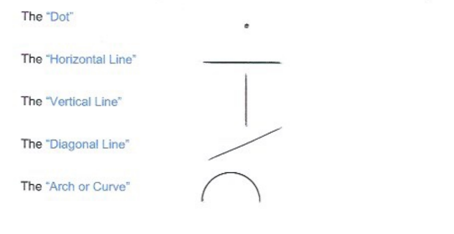
So too, with art we have a language the relies on a similar set of symbols/letters. Unlike our English alphabet of 26 symbols or letters, the “Alphabet of Art” consists of only five. Yup, just five. And here they are.

There is virtually NO OTHER THING that the artist will ever draw! Ever! Someone who may have absolutely no talent at all for art or drawing (and I do not believe that person exists) can make these marks/symbols/letters. Everyone can do that with no fear, trepidation, or doubt. And the wonder of it all is that regardless of your culture, nationality, or spoken language, this alphabet is common to ALL and can be used with extreme fluency and comprehension.
(More Illustrations will follow later)
The Artist’s Language – From Alphabet to Words
How is the “alphabet of art” put to use as a language? Draw two one inch vertical lines side by side, separated an inch apart. Then draw two one inch horizontal lines connecting the verticals’ top and bottom ends. The result is a “Square” shape. Elongate the horizontal or vertical lines and the resulting shape will be a rectangle. Lift or skew one end of a rectangle and the resulting shape will be a parallelogram or a rhombus. (Don’t you wish you had paid attention in geometry class?)
Draw two one inch diagonal lines, connected at the top and separated at their bottom ends by an inch so that they lean in opposite directions. Then draw a one inch horizontal line connecting the two bottom ends of the diagonals. The result will be a triangle. Change the lengths of any of these lines and a different shaped triangle will result.
An arched or a curved line, if connected at both ends becomes a circle. Elongate the circle and you will have drawn an oval or ellipse.
Make two dots separated by any distance and in any direction, one from the other, and you will “perceive” or “sense” that there is a line connecting them – though invisible to the eye. Do we have examples of this in nature? Just look up into the northern sky on any clear night and you will see a series of unconnected dots (stars) that will be recognized as the “Big Dipper.” A shape with no lines! It has been said that the ends of a line are often more important than what lies between them. Is that true? You decide!
If you have followed the directions above, what has been accomplished so far is the drawing of two dimensional shapes of various kinds. Each of these shapes is merely an assemblage of only two of our alphabet letters. Thereby creating a “Word of Art.”
These variously angled or curved lines that we draw are the “Edges” of the shapes created by them. And ALL EDGES of ALL SHAPES are SHARED by adjacent shapes. That’s the truth, plain and simple. There is no getting around it! It’s a simple fact. Understood???
So, by doing what I have described above, you will have created several different “SHAPES.” Everything we see and observe all around us is composed of nothing more than shapes. Shapes, that if you followed the description above, you have already proven you can draw with great skill and finesse.
From Words to Sentences – and more
Now, if we take that one inch square that was first drawn and connect it to another (or a rectangle) on the right side so that they share a common edge, and lift the right side of the second square just a bit so that it becomes a parallelogram, and then do the same to the top of the initial square and skew it to the right so that its right edge becomes common with the top edge of the second square (or rectangle), you have created a three dimensional figure that can be called a cube or box.
Likewise, draw two vertical (or horizontal) lines of the same length, separated by a little bit. Connect the two ends of one side with a curved line. Draw an ellipse (oval) connecting the other ends of the vertical lines. You will now have a three dimensional figure called a cylinder. Cylinders are everywhere in nature!
In like manner, place an ellipse connecting the bottom ends of the original triangle and you will have drawn a cone. Put two or more triangles together so that share a common edge, and you will have drawn a pyramid.
These three dimensional shapes are the “Sentences of Art”, created by the “Words of Art”, created by the “Alphabet of Art!!!!” Now you are prepared to place these all together on your paper or canvas to compose your “Novel of Art,” – your drawing or painting.
That is pretty much all there is to drawing! Add to this an understanding of Proportions, Perspective, and Values, and our “Drawing Toolbox” will be complete.
Why I didn’t realize this before hearing it from Myron Barnstone is beyond me. I guess that’s why he’s the genius/expert and I’m not! But if I had not referenced Myron, you’d be thinking I was the genius/expert. Don’t reference me and this blog ….. and you will be the genius.
Please. Pass it on. Everyone needs to know.
The topic discussed above comprises the beginning of my lesson outline (used in the studio and in workshops) covering the method of composition that I use exclusively for my artwork. It is called Dynamic Symmetry.
THE FULL DOCUMENT, (BE WARNED: It is about 20 pages long) is now a WORD Document, with updated illustrations, and some significant changes to the text. If you would like the file, please email me and I will email it to you ASAP.
(Participants of my Composition Workshop should print the WORD Document and bring it to class
